Thursday, November 18, 2010

Geog7 Lab 7

Geography Lab #7: Mapping the Station Fire in ArcGIS


The aim of this lab is to map and analyze the Station Fire- which is the largest and deadliest wild fire in Los Angeles County in 2009, using GIS data from Governmental agencies. First, I will attempt to map the Station Fire progression from August 29 2009 to September 2 2009 using ArcGIS. Secondly, I will make a series of thematic map that highlight high fire risk neighborhoods in LA County that may be used to inform people who currently live in or plan to live in these areas.


The above map is the Station Fire Temporal Progression map which shows the outlines of the perimeters of the Station Fire over time using data from http://atlas.ca.gov/. The extent map shows where the Station Fire occurred in the context of the State of California. From the progression of the fire perimeter above, I can see a pattern that shows the fire is not spreading out evenly in all directions, but tend to spread to the West and South-West directions predominantly.


I hypothesize that the dry Santa Ana winds that come through Los Angeles in the Fall that blow west offshore into the coast has something to do with the way the Station Fire spreads. According to the Department of Atmospheric Science at UCLA, "Southern California's Santa Anas are dry, north-easterly winds having speeds in excess of 25 knots (46 kilometers/hour) These offshore winds usually occur in late fall and winter when a high pressure system forms in the Great Basin between the Sierra Nevadas and the Rocky Mountains." This information matches the dates of the Station Fire- which also occurred in late fall and early winter, as well as the direction of the fire. Therefore, I have mapped above, high fire risk neighborhoods that lie on the West and South-Western directions of the Station Fire using data on population centers overlaid on the perimeter of the Station Fire. I also overlaid hydrological features onto the map, which shows that the largest water sources lie in the North West and South East, which increase the risk of fire in the South West.


The map above maps the wild fires of 2008 and 2009 in Los Angeles using data from the USDA Forest Service, and along with vegetation cover and population centers. High risk neighborhoods in this map are extension of the hypothesis that the Santa Ana winds are important factors in determining the spread of wild fires, thus neighborhoods that lie in the South West of fire prone areas are marked black. The graph shows the different types and quantity of land cover of Los Angeles County- the land cover that covers the largest non-urban area is the Hardwood Forest and Shrub. According to California Green Solutions, "the Chaparral ecosystem of Los Angeles has highly flammable shrubs" that fuel wild fires. Therefore, identifying the areas with highly flammable vegetation can help identify high fire risk areas as well.


The above map is again another extension of the previous maps but over a larger temporal scale. This time, wild fire data from four different years are mapped together with population centers to show the trend of where fires tend to originate and spread. This map clearly shows that there is a horizontal belt of fire prone areas with three main clusters. Again, all of the fires exhibit the tendency to spread to the West, thus explaining their horizontal elongated shapes and matching my Santa Ana winds hypothesis.

I believe that the information from these thematic maps of fire prone areas can help inform people about the risks of moving to such areas. Such that even if they do chose to lie there, they can mitigate the damage by building their homes with fire resistant materials. The government can also through regulation and zoning, mandate fire resistant materials to be used in buildings homes in such areas to mitigate fire risk. Along with the ideas above, insurance companies can also price their fire insurance premiums higher in these fire prone areas, and if homes are built with certain fire resistant materials, then the premium can be adjusted downwards. These solution can help mitigate human deaths in fire prone areas by increasing the costs of living in these areas, and the deaths of the two firemen such as in the case of the 2009 Station Fire may be prevented in the future.

Monday, November 15, 2010

Geography 7: lab #6

Hillshade map of Grand Canyon, Arizona


Slope Map of Grand Canyon, Arizona


Aspect Map of Grand Canyon, Arizona


3D map of Grand Canyon, Arizona


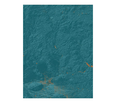
The area that I have selected for this lab is a part of the Grand Canyon, which is located in Arizona. I selected this portion of the Grand Canyon because it contains a mix of low lying, flat and hilly terrain which can accent the different types of spatial analysis conducted using ArcGIS. Each map contains valuable information about the area- elevation, slope inclination, the direction at which each slope faces and a 3D model of the area. I was very impressed with the ability of GIS to build a 3D model, as it also allows for a futuristic "fly-over"- a first person view of a 3D terrain that is almost like you are there in person.


Extent Information:
Top: 34.7227777768969
Right: -111.091666665802
Bottom: 33.142222221235
Left: -112.274444443659

Spatial Reference:
GCS_North_American_1983

Monday, November 8, 2010

Lab 5 Projections

How many decimal degrees does the equator span? 
360.6DD

What about the northern- or southern-most graticule line on the map?
180.46DD

What do these two lines in fact represent?
(latitude, longitude)

From Washington D.C., USA to Kabul, Afghanistan
Spherical GCS Model Distance = 6932.4 miles
All distances posted below refers to the distance from Washington D.C. to Kabul in different map projections.

Conformal Map Projection
Mercator Projection Distance =10189.5 miles
Gall Stereographic Projection Distance = 7141.3 miles


Equal Area Map Projections
World Sinusoidal Projection Distance = 8112.8 miles
World Cylindrical Equal Area Projection Distance = 10066.6 miles


Equidistant Map Projections
Equidistant Conic Projection Distance = 6985.2 miles
Equidistant Cylindrical Projection Distance = 5079.6 miles

In this lab, we had to use project a three-dimensional spherical model of the Earth (Spherical GCS model) onto a two-dimensional planar model that falls into three main categories- the conformal, equidistant and equal area type map projections. Furthermore, as seen above, each category of map projection type can have more than one way to be projected: conformal projections include the Mercator and gall stereographic projections; equal area projections include the world sinusoidal and world cylindrical equal area projections; and lastly,  equidistant projections include the equidistant conic and equidistant cylindrical projections.

The purpose of this lab is to recognize the inevitable distortion that occurs whenever a 3D surface is projected onto a 2D surface, and this can be observed in the differences the projections look from the original spherical GCS model. The conformal projections preserves shapes and angles on a map- and this is important if the map is needed for bearings or angles in flight or ship navigation. The equal area projection preserves the proportionality of areas on the map- important if you want to calculate area. Lastly, the equidistant projection preserves distances from a certain point- which is important if distances are to be calculated correctly.

As seen above, each type of map above measures a different distance from Washington D.C., USA to Kabul, Afghanistan, which shows that if you blindly use one map projection without knowing how it is being distorted, it will give you a lot of inaccuracy in calculations. The perils could include getting wrong bearings while navigating, or choosing a projection that doesn't conserve areas when you are trying to do a comparison between two areas in the world, or choosing a projection that doesn't conserve local distances when you are trying to measure distance. For example, the spherical GCS model, which should be the most accurate because it has not been distorted, shows the distance between the two cities to be 6932.4 miles, and the most accurate map projection that shows this is the equidistant map projection which shows 6985 miles, whereas other map projections are up to hundreds of miles off.

The significance of map projection is the ability to project a 3D model of the Earth onto a planer 2D surface. This has mainly practical purposes because planar maps can be easily stored and read, whereas keeping a three dimensional globe is cumbersome and could be harder to read. However, with such practical improvements come with the drawback of distortion- in the areas of angles, distances and areas. The critical part is to know how each map projection distorts and conserves certain features, and on a case by case basis, depending on the task that the user wants to do, there is a most suited map projection.

Monday, November 1, 2010

Geog 7 Lab# 4


Using Geographic Information System software for the first time is really an eye-opening experience. I enrolled in this course because one of my friends who had graduated with an environmental engineering degree, and had worked in the green industry for two years, talked to me about her job and how she uses this software frequently in different situations. This sparked my interest, and my hands on experience with this $10,000 piece of software did not disappoint. Although the lab was merely following directions of the GIS tutorial, it really made me understand why it's called a "system," namely, there is a lot of data that is hidden behind the simple maps above, and the interaction of different data can be visualized by superimposing them on top of one another. Another fact that impressed me was the sheer amount of manipulation that is available- that both numeric and spatial data can be manipulated in a very precise and subtle way. For example, a user can choose from dozens of styles for a roadway symbol, and customize it to his or her liking.

The negative side of my experience with GIS has to do with its complicated structure, and it showed me that this software requires a lot of training before it can be used well. There are literally hundreds of options, buttons, drop-down-lists and tool-bars to choose from and it would take some time to get used to it. Even though the tutorial was clear for the most part, I had trouble figuring out how the data and the map have to be treated differently, and that ArcCatalogue was needed to copy the entire project. In summary, I think I can see how using GIS software can be a very tedious task for the user, and the time frame needed to be proficient with GIS can take months to years due to its sophistication and complexity.

GIS is a very powerful tool and it holds a lot of potential in my opinion. Facts and figures cannot be debated, and the fact that GIS is based on rigorous data that can be checked, makes it a powerful tool in negotiations and predictions. People with different opinions may collect data and be able to visualize it using GIS, and visual data is the easiest and quickest form of information to understand. Implications or theories by different groups can be modeled, and using real world data, predictions can be made that all parties can agree on. For example, a watershed system is very complex, and using traditional forms of presentation would require stacks of slides or graphs that would be disorienting. However, using GIS, that can overlay the data into one map can make visualization easy as well as maintaining the complexities of a real watershed system. This is very efficient in an information presentation standpoint, but GIS can further be used to predict what would happen, for example, if a flood were to occur in the watershed system. High risk areas of flash floods can be located and preventative actions can be taken. The potential of GIS is even higher when you consider that the example is only one of literally millions of ways to use GIS. Just to name a few, GIS is used in excavation, crime prevention, infrastructure upkeep, military and farming.

GIS is a very powerful tool, and like how the police choose to use it to predict and prevent crime, the technology can also be used in destructive ways. Terrorists could potentially use the same methods to locate high risk areas and target them. Another potential pitfall could be that a spatial boundary be superimposed on areas or ecology that don't have well defined borders, thereby creating a human construct of boundary where one did not exist before. Some animals may not perceive these boundaries and the GIS map may not represent a ecosystem in flux very well.